There’s nothing guaranteed to get an author worked up as a chat about book covers. We all have quite fixed ideas of how our book should look but sometimes a publisher thinks differently and we bow to their knowledge of the market. They usually do know best!

As a reader too, I’m increasingly aware of the impact of a cover, or a cover and title together. As a native of Fife, I could never have resisted Evie Wylde’s The Bass Rock despite knowing nothing about it until I wandered into a bookshop with a book token in my pocket. Done deal – and not one I regretted. It’s a great book.
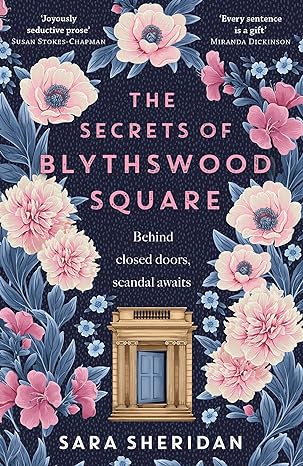
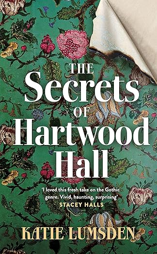
However here’s something that puzzles me. Earlier this year, I read Katie Lumsden’s The Secrets of Hartwood Hall ‘the mysterious and atmospheric debut novel for fans of Charlotte Brontë’s Jane Eyre…’ which sums it up pretty neatly. I thoroughly enjoyed this book which does just what is says on the tin (or cover) in reminding us of the joys of a Victorian gothic mystery with pacey narrative and intriguing plot twists with some fascinating period detail. The cover isn’t especially striking but conforms to ideas of Victorian fiction based around a governess in a country house where everyone is hiding something.
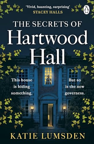
Soon after that, I spotted Lesley McDowell’s Clairmont as due for release ‘the bold new retelling of the story of Lord Byron and the Shelleys, from the perspective of Claire Clairmont’, and as I’m a sucker for biographical fiction I mentally added it to my TBR list. I recently read it and reviewed it here, but even before I dived in, I was surprised that this novel ‘the sensuous hidden story of an influential historic woman’ had a cover so similar to Hartwood Hall. It’s a totally different read and I struggle to equate its heroine (my abiding memory of her is running around Lake Geneva in a state of deshabille!) with the demure-looking creature that graces the cover. Yes, there’s text to give added flavour but the conventional elements of genre historical fiction feel at odds with the style of the book which I found highly literary and immersive. I guess it doesn’t really matter what I think, but I suspect if the book had been lying on a bookshop table, I might well have passed it by.

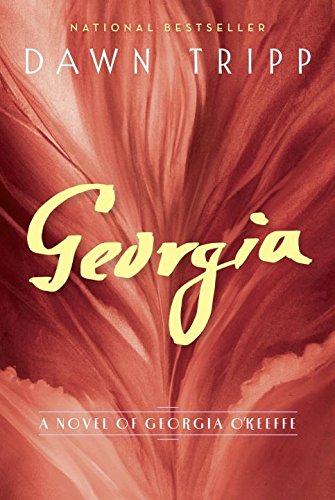
I’m sure the publisher had reasons for stamping the book in this way. Perhaps ‘straight’ historical fiction is more popular as a genre than a fictional biography which relies on a big and idiosyncratic characters. For a contrast in style take a look at Dawn Tripp’s Jackie and Georgia which to me are far more striking.
More confusingly still, I see that since I read it, Hartwood Hall has gained a new more pastel cover.
What do I foresee cover-wise for The Absent Heart? I’m keeping an open mind, but something floral might be hard to avoid!