

There’s nothing to whet the appetite for a book launch like boxes of of the long-awaited book. But although you might not notice from this photo, these two consignments aren’t quite the same. How come?
Our proof copies of Blink (this is its stable name by the way, books are like race-horses in that respect) had ‘gloss’ finish covers, possibly by default. Very nice they were too, but fiction is traditionally matte finish (if you hadn’t notice check those bookshelves now) and although In the Blink of an Eye veers towards faction, we didn’t want it slipping into the non-fiction camp.
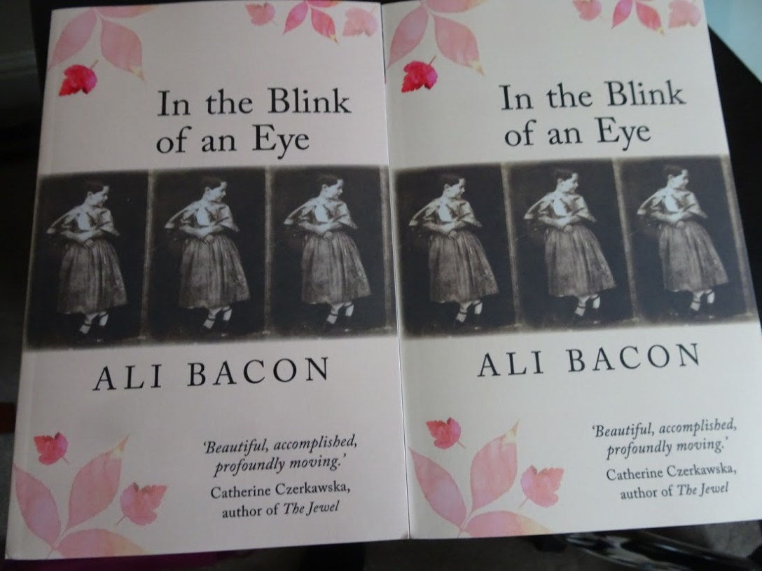
Then there was the calotype thing. The cover image (original here) is result of the process of the 1840’s which used only plain paper. It would be almost another ten years until steps were taken to find a smooth surface for photographic printing (beginning with albumen printing, then the use of glass plates and eventually photographic film). I did think a glossy finish would be anachronistic.
And so our order went in for 150 copies, ‘matte lamination’. Alas and alack, when they arrived, all 150 were in the old gloss. We were not amused! On the other hand, time to order replacements was running short. And although not exactly as we had specified, the books were/are reasonably for for purpose. As the alternative was to destroy them (Nooo, I cried!) we decided to keep them but ordered another batch for the future. Needless to say these turned up much more quickly and so now those of you coming to this month’s events will have a choice, at least if I can organise it! I have written M and G in big letters on each box. It will be a very useful piece of research is what I am thinking to put both versions out and see which gets picked up the most.
Which do I prefer? I can’t decide! The matte batch look more as I originally expected and would expect to see on a bookshop table. But there is a slight difference in the colours and I quite like the rosier shades of the gloss. Over to you I think!
Meanwhile here’s a sneak preview of what’s inside those pesky wrappers.

After advice from beta readers, I added a ‘cast list’ (yes, these are mostly real people). A good idea according to reviewer Anne Goodwin who even added a cast member of her own!

Many chapters began as distinct short stories. when I put them together they fell quite neatly into these sections: Exposure, Developing, Fixing, Fading, New Processes, The Calotype Reconsidered and Ways Ahead. Although the book is about people rather than the pictures they created, I was pleased with to be able to reflect the processes they used in the structure of the book and was given special mention by the reviewer for the Contemporary Small Press project.
By the way, I’m going to be having a small celebration on Facebook when this post goes up. Join me there!
