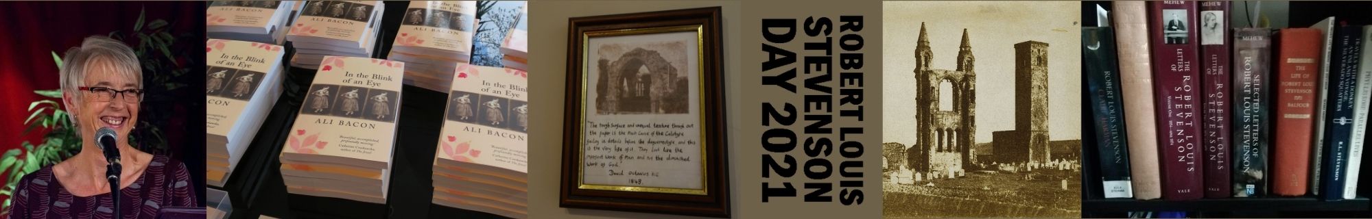
What author doesn’t long to see the book they have laboured over out in the world between shiny covers? And how many authors get the cover they want? One of the biggest gambles in the writer’s mind when he/she gives a book over to the publisher is how the cover design will turn out and I know plenty of people who haven’t been happy with a publisher’s choice (even if sales figures show it has been the right one). I can honestly say I did get what I wanted, even if at the outset I didn’t know exactly what that was. I’m hoping Linen’s expertise means that everyone else will like it too.
Teamwork!
Starting out with Linen Press, I was realistic in my expectations – the author knows the book, the publisher knows the market. I also had experience with my first novel of the things that can go wrong and had looked in a cursory way at some principles of cover design (here’s a simplistic but light-hearted overview). I was ready to sit back and cross my fingers that Linen’s choice would be okay. I was quite surprised when the first question was ‘what kind of cover do you have in mind?’
This is the nice thing about a small press. It’s a team effort. The author is fully involved. A month down the line and no nearer to a solution, I was thinking this is the trouble with a small press. The author is fully involved. Please somebody fix it!
Market Research

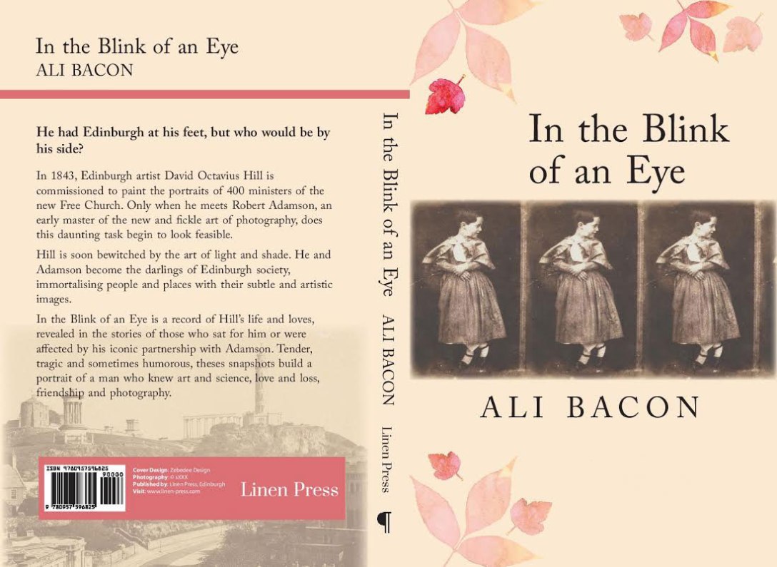
We did establish some basic principles. The book was inspired by early photographs all available in digital form – let’s use them! But which one? I wanted to use them all (well not all 3500 but all my favourites) and after playing on the totally addictive Canva I came up with a great book cover, I thought, until somebody pointed out it looked like non-fiction. It would also have required licensing several images. I can also see now it was deadly dull.
After some hasty market research amongst friends real and virtual, we settled on a portrait of my hero’s daughter as the most engaging image and Linen Press gave a brief to one of their associated designers. I still wonder if my reaction was hasty but I said straight away I hated the preliminary design (which I did). Linen Press agreed. So it was back to the drawing board with a plan for us to come up with a general idea which a graphics expert would knock into the right shape. This, I have to say, is when things got a bit hairy, but what the hell, here are a few of the things we toyed with and, thank goodness, abandoned (aka Love in a Mist, The Wonky Triptych, Headless Chicken.)


Decision time
With time speeding on and the need for Advance Information getting more urgent all the time, Lynn of Linen Press arranged to meet me for a final decision. We had a shortlist which we mulled over in a café on Bristol’s Gloucester Road (which I won’t name as the sandwiches were terrible) taking care not to trip up any customers with our laptop paraphernalia. Unfortunately none of our final four got a thumbs up from both of us.
 The afternoon shift were sauntering in by the time I said ‘what about that idea of the three pictures in a row?’ This was an idea I thought I had floated but which Lynn had missed. I had to plug in my own (yes it’s very old and doddery ) laptop to show her. By now we were taking up more than half of the cafe and getting some very funny looks from the clientele as we hopped from one tiny table to another. But it was worth it in the end.
‘I like it!’ she said, ‘I really like it!’ I still liked it too.
It wasn’t the finished article, of course, for which we have to thank Bek of Zebedee Design, but now it is!
All’s Well…
In retrospect I think there was some method to our madness. We did test things out amongst different circles (sometimes with depressing results!) and took feedback on board. I think we both knew what would and wouldn’t work when we saw it and we did dovetail successfully – Lynn had the eye for colour, house-style and the bookshop imperatives. I harped on about period detail (I’ve passed over the interlude in which many camera images were sought and discarded) and went with a gut instinct which I don’t think was too far off the mark .
At the moment everybody’s happy. Let’s hope it stays that way when reviews come in!

I love that cover – and think it is definitely the best choice. My publisher too consults about covers although obviously sales have serious input too. I’ve loved all my covers – they’re good at it, I think – but like yours, the recent one gave us some problems – mostly because the title of the novel contains the word ‘ring’ and yet any cover involving a gold ring, while lovely in the imagination, turns out to be like a cover of Brides Magazine in reality. Then there was a eureka moment from the publisher (not from me, I hasten to add!) The image arrived late one night attached to an email, and blew me away. Turns out everyone was happy. But I think you’re right – you test things out, get feedback, find out what doesn’t work, realise that you will know it when you see it – and suddenly there it is. Congratulations on the book – can’t wait to read it!
LikeLiked by 1 person
Yes, I love the Posy Ring despite it’s not having a ring! I can’t believe how long I spent looking at cameras which we never used.
I like all your Saraband covers too and always thought LP were strong in that department even though the books are very varied. So I did have faith – just needed it for a few weeks! They were also very good at knowing when to stop worrying and knowing it was DONE. I probably could have gone on forever. I enjoyed the Curiosity Cabinet so looking forward to TPR (I fancy Cal Galbraith already – great name!).
LikeLike